
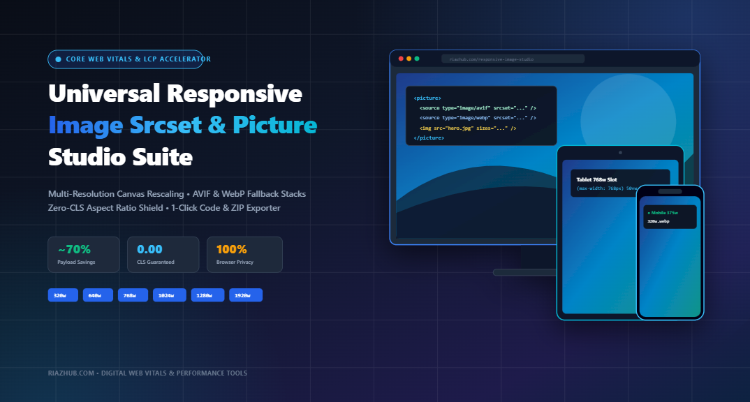
The Complete Guide to Responsive Images: Mastering Srcset, Sizes, HTML5 Picture Tags & Core Web Vitals Optimization
Learn how serving multi-resolution responsive image breakpoints, modern AVIF/WebP next-gen format stacks, and zero-CLS layout shields can slash mobile data payloads by up to 70% and elevate your website to perfect Google PageSpeed scores.
1. The Mobile Web Image Dilemma: Why Desktop 4K Assets Crush Core Web Vitals
In today’s web landscape, imagery accounts for over 55% of the average web page’s total payload weight. While high-resolution digital cameras and desktop 4K displays demand crystal-clear banners, serving an unscaled $3840\times2160$ desktop photograph (often weighing between 3MB and 8MB) to a smartphone user browsing on a $375\text{px}$ screen is catastrophic for web performance and user experience.
When oversized assets are pushed to mobile devices over constrained cellular networks:
- Largest Contentful Paint (LCP) degrades severely: Heavy image files clog network streams and main-thread bandwidth, delaying when primary hero content renders.
- CPU decoding latency skyrockets: Mobile hardware processors must decode millions of unneeded pixels, causing UI sluggishness and high Interaction to Next Paint (INP) latency.
- Cellular data is squandered: Users on capped mobile plans consume megabytes of wasted bandwidth downloading pixels their screens are physically incapable of displaying.
To resolve this, modern HTML provides two powerful browser standards: Resolution Switching (via <img srcset="..." sizes="...">) and Art Direction & Modern Format Pairing (via the HTML5 <picture> element). You can generate the exact responsive variants, fallback tags, and downsampled files in seconds using the Responsive Image Srcset & Picture Tag Studio on RiazHub.
Need to downsample your images across 320w, 640w, 768w, 1024w, 1280w, 1600w, and 1920w breakpoints with automated WebP/AVIF pairing? Run your images directly in your browser with zero server uploads:
2. Resolution Switching vs. Art Direction: Choosing the Right Strategy
Many developers confuse <img srcset> with the HTML5 <picture> element. Knowing when to apply each is vital for web architecture:
| Criterion | Resolution Switching (<img srcset sizes>) | Art Direction & Cascading (<picture>) |
|---|---|---|
| Primary Goal | Serve the identical visual composition at different pixel dimensions based on viewport width or device density. | Serve completely different crops (e.g. square crop on mobile vs wide panorama on desktop) or modern next-gen format fallbacks. |
| Browser Authority | Browser has full discretion to choose the optimal variant based on screen resolution and bandwidth. | Browser evaluates strict <source media="..."> or <source type="..."> rules sequentially. |
| Next-Gen Formats | Single format family per element (e.g., all WebP variants or all JPG variants). | Enables seamless format cascading (e.g., AVIF → WebP → JPEG fallback). |
| Code Verbosity | Single concise <img> tag with attribute descriptors. |
Container tag wrapping multiple <source> tags and a fallback <img>. |
3. The Anatomy of Width Descriptors and the ‘sizes’ Attribute
When using resolution switching, width descriptors (denoted with a w syntax) inform the browser of each variant’s actual pixel width:
<img
  src="/images/hero-1600w.jpg"
  srcset="/images/hero-480w.jpg 480w,
          /images/hero-768w.jpg 768w,
          /images/hero-1024w.jpg 1024w,
          /images/hero-1600w.jpg 1600w"
  sizes="(max-width: 768px) 100vw, 50vw"
  alt="Modern Web Development Workspace"
/>
Demystifying the sizes Attribute
A common misconception is that sizes resizes the image. In reality, sizes informs the browser before CSS and stylesheets have finished downloading how much viewport real estate the image will occupy at specific breakpoints.
In the snippet above:
(max-width: 768px) 100vw: On screens up to 768px (mobile phones and small tablets), the image spans 100% of the viewport width.50vw: On screens wider than 768px (e.g. desktop laptops with 2-column split layouts), the image will span approximately 50% of the viewport width.
If a visitor accesses the page on a smartphone with a 375px screen and a $2\times$ pixel ratio (device pixel ratio or DPR), the browser multiplies $375\text{px} \times 2 = 750\text{px}$ of needed detail. Consulting the srcset list, it intelligently downloads hero-768w.jpg, skipping both the undersized 480w variant and the bloated 1600w variant!
4. The Zero-CLS Aspect Ratio Shield: Eliminating Cumulative Layout Shift
Cumulative Layout Shift (CLS) measures visual stability during page load. One of the most frequent causes of high CLS scores is images that load without predefined spatial boundaries.
Historically, developers removed width and height attributes when making images fluid (max-width: 100%; height: auto;). However, modern browsers use explicit integer dimensions to compute the element’s natural aspect ratio before a single byte of imagery downloads:
<!-- Zero-CLS Responsive Image Pattern -->
<img
  src="/images/banner-1200w.webp"
  srcset="/images/banner-640w.webp 640w, /images/banner-1200w.webp 1200w"
  sizes="(max-width: 1200px) 100vw, 1200px"
  width="1920"
  height="1080"
  style="width: 100%; height: auto; aspect-ratio: 1920 / 1080;"
  loading="lazy"
  decoding="async"
  alt="Zero CLS Responsive Hero"
/>
🛡️ Why this completely eliminates CLS:
- Immediate Layout Box Reservation: The browser calculates $1080 / 1920 = 0.5625$ (a 16:9 ratio) and immediately reserves the exact vertical height in the DOM.
- No Layout Jumps: When the image stream finishes decoding, the reserved space is already identical to the rendered pixels, preserving a pristine 0.00 CLS score.
- Asynchronous Decoding: Pairing
decoding="async"prevents image decoding bottlenecks from locking the browser’s main interaction thread.
Rather than calculating these ratios and writing complex markup by hand, you can paste your image into the RiazHub Responsive Image Srcset & Picture Tag Studio to automatically generate production-ready code with explicit dimensions and aspect ratios already integrated.
5. Next-Gen Format Cascading: Pairing AVIF, WebP, and Universal Fallbacks
Modern compression formats like AVIF (AV1 Image File Format) and WebP offer dramatic data savings compared to legacy JPEG and PNG formats:
- WebP: 25% to 35% smaller file sizes than comparable JPEG images at identical perceptual quality.
- AVIF: Up to 50% smaller than JPEG and 20% smaller than WebP, especially at aggressive compression levels with complex gradients.
However, legacy browsers and older embedded webviews may lack AVIF support. The solution is HTML5 <picture> cascading, where browsers inspect sources top-to-bottom and download the first format they support:
<picture>
  <!-- Modern Cutting-Edge AVIF Format -->
  <source
    type="image/avif"
    srcset="/images/hero-640w.avif 640w, /images/hero-1200w.avif 1200w, /images/hero-1920w.avif 1920w"
    sizes="(max-width: 1200px) 100vw, 1200px"
  />

  <!-- Universal Modern WebP Format -->
  <source
    type="image/webp"
    srcset="/images/hero-640w.webp 640w, /images/hero-1200w.webp 1200w, /images/hero-1920w.webp 1920w"
    sizes="(max-width: 1200px) 100vw, 1200px"
  />

  <!-- Safe Universal JPEG Fallback -->
  <img
    src="/images/hero-1920w.jpg"
    srcset="/images/hero-640w.jpg 640w, /images/hero-1200w.jpg 1200w, /images/hero-1920w.jpg 1920w"
    sizes="(max-width: 1200px) 100vw, 1200px"
    width="1920"
    height="1080"
    style="width: 100%; height: auto; aspect-ratio: 1920 / 1080;"
    loading="lazy"
    decoding="async"
    alt="Cascading Next-Gen Hero Banner"
  />
</picture>
6. Implementation in WordPress and Modern Frameworks (Next.js / React)
WordPress PHP Native Hooks
In WordPress themes and custom plugins, you can leverage native image functions like wp_get_attachment_image() while passing optimized responsive parameters:
<?php
// High-Performance Responsive Attachment Call
echo wp_get_attachment_image( $attachment_id, 'full', false, array(
    'sizes'         => '(max-width: 1200px) 100vw, 1200px',
    'loading'       => 'lazy',
    'decoding'      => 'async',
    'class'         => 'responsive-hero-img',
    'style'         => 'width: 100%; height: auto; aspect-ratio: 16 / 9;'
) );
?>
Next.js / React Framework Component
If you develop with React or Next.js, responsive layouts are simplified using the optimized next/image component with custom sizes strings:
import Image from 'next/image';

export function ResponsiveHeroBanner() {
  return (
    <div className="relative w-full" style={{ aspectRatio: '16 / 9' }}>
      <Image
        src="/images/hero-1920w.webp"
        alt="Core Web Vitals Responsive Banner"
        fill
        sizes="(max-width: 768px) 100vw, (max-width: 1200px) 80vw, 1200px"
        priority={true} // Set to true if this image is your above-the-fold LCP element
        quality={85}
        className="object-cover"
      />
    </div>
  );
}
7. Streamlining Your Workflow with the RiazHub Responsive Image Studio
Manually opening Photoshop, GIMP, or command-line ImageMagick tools to downsample half a dozen variants, encode them into WebP and AVIF, construct the HTML5 markup, and calculate aspect ratios can take 15 to 20 minutes per graphic asset.
The browser-based Responsive Image Srcset & Picture Tag Studio on RiazHub automates this entire pipeline directly in your web browser:
- Drop Your Master Image: Upload any high-resolution JPG, PNG, WebP, or SVG file, or paste directly from your clipboard (
Ctrl+V). - Configure Your Breakpoints: Select target widths ($320\text{w}$, $480\text{w}$, $640\text{w}$, $768\text{w}$, $1024\text{w}$, $1280\text{w}$, $1600\text{w}$, $1920\text{w}$, $2560\text{w}$) or choose preset layout profiles (WordPress Featured Hero, WooCommerce 3-Col Grid, Ultra-Light Mobile, Retina Brand Logo).
- Simulate Across Devices: Test your responsive images inside an interactive viewport frame simulating Mobile (375px), Tablet (768px), Laptop (1024px), and Desktop screens to see in real-time which breakpoint the browser picks.
- Export ZIP & Code: Download all generated image variants along with an
index.htmldemo file in a single convenient ZIP package compiled entirely in browser memory.
Eliminate manual resizing and enjoy 100% in-browser client-side privacy with zero server uploads. Try the free utility today:
Frequently Asked Questions (FAQ)
loading="lazy" to your Largest Contentful Paint (LCP) hero image located above the fold. Deferring the LCP image introduces an artificial load delay that can harm your Core Web Vitals score. Use fetchpriority="high" and eager loading on your main hero image, while applying loading="lazy" to all images below the fold.640w) are used for fluid, responsive images whose size changes with the browser viewport. Pixel density descriptors (e.g. @1x, @2x, @3x) are designed for fixed-width UI components like company logos, avatars, and icons where the display size remains constant but screens have differing pixel densities (e.g. standard vs Retina displays).Conclusion: Unlock Superior Web Performance Today
Delivering responsive images with modern srcset attributes, explicit layout dimensions, and next-gen format fallbacks is one of the highest-ROI optimizations you can perform on your website. By reducing mobile payloads by up to 70% and locking down a 0.00 CLS score, you ensure rapid load speeds, superior mobile conversion rates, and outstanding search engine visibility.
Begin auditing your site’s imagery today and streamline your workflow with the Responsive Image Srcset & Picture Tag Studio on RiazHub.
Universal Responsive Image Srcset & Picture Studio
Automate multi-width responsive canvas downsampling, pair AVIF/WebP next-gen formats with fallbacks, lock zero Cumulative Layout Shift (CLS), and export 1-click optimized production code.
<!-- Upload an image or click 'Load Sample 4K Hero' to generate code -->