
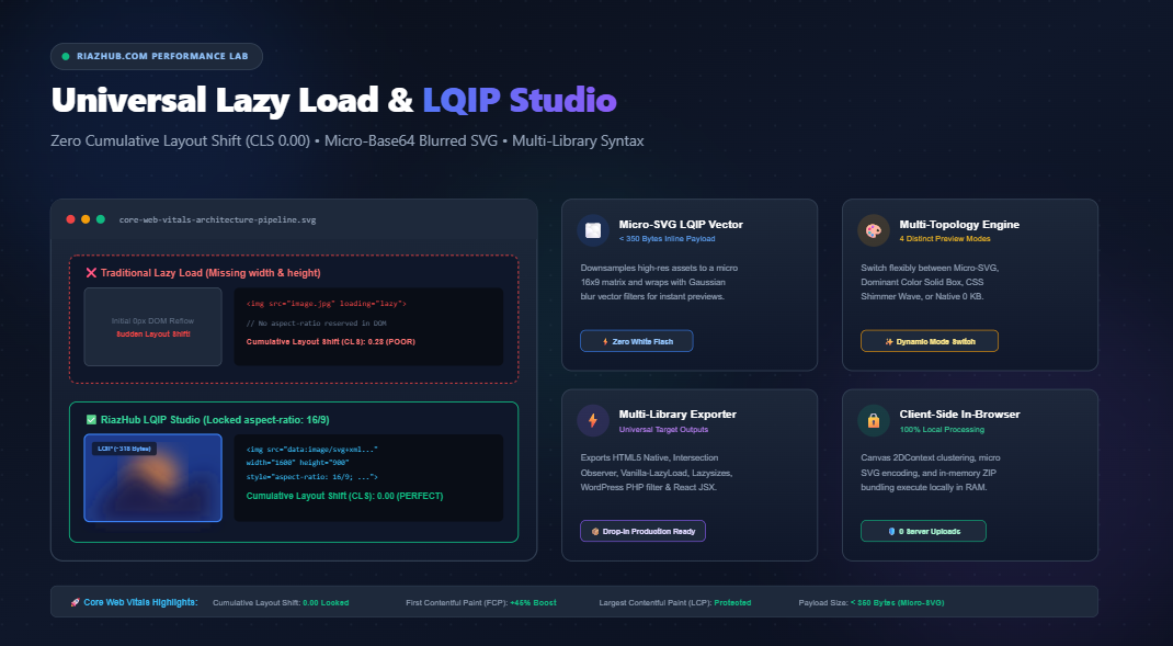
Mastering Core Web Vitals: Eliminating CLS with Low-Quality Image Placeholders (LQIP) and Modern Lazy Loading
Images account for more than 60% of total web page weight. Discover how missing layout geometry destroys your Cumulative Layout Shift (CLS) score and how to construct microscopic blurred SVG placeholders under 350 bytes to deliver an instant, shift-free user experience.
Looking to generate zero-CLS lazy load markup, extract micro-Base64 blurred vector SVGs, and calculate exact aspect ratios right now? Use our free browser-based utility:
1. The Performance Paradox of Modern Image Lazy Loading
In early web development, browsers loaded every graphic declared in the HTML document simultaneously, consuming bandwidth and delaying initial rendering. With the advent of modern performance standards and Google’s Core Web Vitals metrics, deferred loading (lazy loading) became an essential industry standard.
However, naive lazy loading introduces a severe side effect: Cumulative Layout Shift (CLS). When developers apply loading="lazy" to an <img> element without declaring its exact intrinsic dimensions, the browser initially allocates zero vertical height to the container. As the visitor scrolls into view, the binary file streams in, and the browser abruptly reflows the document, pushing text blocks, navigation bars, and buttons down the screen.
According to Google’s ranking algorithms, any CLS score exceeding 0.10 is flagged as “Needs Improvement,” while scores above 0.25 result in direct search ranking penalties. To achieve a flawless CLS score of 0.00, developers must guarantee that layout geometry is fully locked in the browser DOM before a single image byte begins downloading. You can test and verify your layout locks using our Universal Lazy Load & LQIP Studio.
2. The Mathematics of Zero-CLS: Aspect-Ratio Clamping
Before CSS aspect-ratio gained universal browser support, developers relied on the “padding-bottom percentage hack”, calculating the height-to-width ratio:
/* Legacy Padding Hack */
.aspect-box {
  position: relative;
  width: 100%;
  padding-bottom: 56.25%; /* (9 / 16) * 100% for 16:9 ratio */
  height: 0;
}
.aspect-box img {
  position: absolute;
  top: 0; left: 0;
  width: 100%; height: 100%;
}
Today, modern rendering engines (Chrome, Firefox, Safari, and Edge) support both the native CSS aspect-ratio property and automated dimension mapping when explicit width and height attributes are declared on the tag:
<!-- Modern Zero-CLS Image Markup -->
<img
  src="https://example.com/photo.webp"
  alt="Scenic Landscape"
  width="1600"
  height="900"
  loading="lazy"
  decoding="async"
  style="aspect-ratio: 16 / 9; width: 100%; height: auto;"
/>
By declaring width="1600" and height="900" alongside aspect-ratio: 16 / 9, the browser reserves the precise bounding box during the first parse pass, completely eliminating reflow jumps. Our online Lazy Load Image Generator automatically calculates the greatest common divisor $\gcd(W, H)$ to output mathematically optimal aspect ratios for any image resolution.
3. The Evolution of Placeholders: Why Micro-SVG LQIP Beats Low-Res Thumbnails
While empty reserved boxes prevent layout shifts, they often leave visitors staring at blank gray voids while waiting for high-resolution images to download over mobile data networks.
To solve this, frontend architects developed Low-Quality Image Placeholders (LQIP). However, early LQIP approaches had critical flaws:
| Placeholder Technique | Payload Weight | HTTP Overhead | User Experience (UX) |
|---|---|---|---|
| External Low-Res JPEG Thumbnail | 2 KB – 8 KB | 1 Extra HTTP Request (Network contention) | Pixelated, delayed preview |
| Dominant Hex Solid Color | 0 Bytes (CSS) | Zero | Flat solid matte, no preview detail |
| CSS Shimmer Wave Skeleton | 0 Bytes (CSS) | Zero | Clean animated loader, but no content silhouette |
| Micro-Base64 Blurred SVG (LQIP) | < 350 Bytes | Zero (Inline Data URI) | Immediate, smooth photographic cross-dissolve |
How the Micro-Base64 Blurred SVG Architecture Works
Instead of requesting an external thumbnail or embedding an oversized 4KB JPEG base64 string, the RiazHub LQIP Studio downsamples the source image inside your browser down to a microscopic $16 \times 9$ or $12 \times 12$ matrix on an HTML5 Canvas.
This tiny pixel matrix is converted into an ultra-compact WebP or JPEG data URI and wrapped inside an inline SVG equipped with an SVG Gaussian blur filter:
<svg xmlns="http://www.w3.org/2000/svg" viewBox="0 0 1600 900">
  <filter id="b">
    <feGaussianBlur stdDeviation="12"/>
  </filter>
  <image filter="url(#b)" preserveAspectRatio="none" x="0" y="0" width="100%" height="100%"
         href="data:image/webp;base64,UklGRmYAAABXRUJQVlA4..."/>
</svg>
Because SVG filters execute directly on the visitor’s GPU, this microscopic 300-byte vector markup creates a rich, organic blur preview with zero server requests, zero render-blocking latency, and zero Cumulative Layout Shift.
4. Native loading=”lazy” vs. JavaScript IntersectionObserver
When should you rely on the browser’s native loading="lazy" attribute, and when should you utilize a JavaScript IntersectionObserver?
- Native HTML5
loading="lazy": Best for standard blogs and editorial content where minimum JavaScript execution is desired. Modern browsers handle viewport detection automatically. However, developers cannot customize the trigger distance (Chrome may load images up to 1250px before they enter the screen on slower connections). - JavaScript
IntersectionObserver: Essential when you require fine-grained control over fetch thresholds (e.g., triggering download exactly 200px or 300px before the element enters the viewport) or when orchestrating synchronized blur-to-sharp cross-dissolve transitions via CSS classes like.is-loaded.
With the RiazHub Universal Lazy Load Tool, you can toggle seamlessly between HTML5 Native, custom IntersectionObserver, Vanilla-LazyLoad, and Lazysizes syntax with a single click.
5. Automating Lazy Loading in WordPress via the_content Filter
If you run a WordPress publication, manually updating hundreds of historical blog post images is impractical. Instead, you can attach a lightweight filter hook to the_content inside your child theme’s functions.php or Code Snippets plugin:
<?php
/**
 * Automatically inject native lazy-loading, async decoding, and aspect-ratio
 * into all post content images on RiazHub.com
 */
add_filter('the_content', function ($content) {
    if (is_admin() || wp_doing_ajax()) {
        return $content;
    }

    return preg_replace_callback('/<img([^>]+)>/i', function ($matches) {
        $img = $matches[0];

        // 1. Enforce native lazy loading
        if (strpos($img, 'loading=') === false) {
            $img = str_replace('<img', '<img loading="lazy"', $img);
        }

        // 2. Enforce async decoding
        if (strpos($img, 'decoding=') === false) {
            $img = str_replace('<img', '<img decoding="async"', $img);
        }

        // 3. Inject low priority for below-the-fold assets
        if (strpos($img, 'fetchpriority=') === false) {
            $img = str_replace('<img', '<img fetchpriority="low"', $img);
        }

        // 4. Extract dimensions and lock aspect-ratio
        if (preg_match('/width=["\'](\d+)["\']/i', $img, $w) &&
            preg_match('/height=["\'](\d+)["\']/i', $img, $h)) {
            $width = intval($w[1]);
            $height = intval($h[1]);
            if ($width > 0 && $height > 0) {
                $styleAppend = "aspect-ratio: {$width} / {$height}; height: auto;";
                if (strpos($img, 'style=') !== false) {
                    $img = preg_replace('/style=["\']([^"\']*)["\']/i', 'style="$1; ' . $styleAppend . '"', $img);
                } else {
                    $img = str_replace('<img', '<img style="' . $styleAppend . '"', $img);
                }
            }
        }

        return $img;
    }, $content);
}, 20);
You can generate tailored variations of this filter directly from the RiazHub Lazy Load Studio, complete with options for custom CSS classes and transition styles.
6. Step-by-Step: Generating Production-Ready Markup with RiazHub Studio
Generating zero-CLS markup and micro-SVG placeholders takes less than 5 seconds using our in-browser tool:
- Visit the Tool: Navigate to https://riazhub.com/lazy-load-image-lqip in any modern browser.
- Upload or Paste Assets: Drag and drop your image files (JPG, PNG, WebP, AVIF, SVG, or GIF), paste directly from your clipboard (
Ctrl+V), or click Load Sample Photo to test immediately. - Select Your Placeholder Topology: Choose between Blurred SVG (LQIP), Dominant Color Solid, Shimmer Skeleton Wave, or Native Only.
- Fine-Tune Blur & Downsampling: Adjust the micro-matrix resolution (8×8, 16×16, or 24×24 px) and tune the Gaussian blur deviation slider to match your visual branding.
- Preview in the 60 FPS Viewport Simulator: Test how the image triggers as you scroll down the simulated mobile/desktop track with configurable root margin thresholds.
- Export Code: Copy the HTML snippet, copy the WordPress PHP filter, grab the React JSX component, or click Download Code Bundle (.zip) to receive a complete zero-dependency package.
Conclusion: A Faster Web with Zero Layout Shifts
Passing Google’s Core Web Vitals is no longer optional for businesses seeking organic search visibility. By replacing unstyled blank image boxes with micro-Base64 blurred SVG placeholders and locking dimensions with aspect-ratio, you protect your visitors from annoying page jumps while providing an ultra-fast, premium browsing experience.
Ready to Optimize Your Site Images?
Eliminate Cumulative Layout Shift, generate micro-SVG blurred previews, and export production code bundles in 1-click. 100% free and processed locally inside your browser.
Universal Lazy Load & LQIP Studio
Eliminate Cumulative Layout Shift (CLS $0.00$), generate micro-SVG blurred placeholders ($< 350\text{ bytes}$), construct responsive lazy markup, simulate viewport trigger thresholds, and export production code bundles in 1-click.
Fast Paint Hero & Zero Cumulative Layout Shift
Below this hero section, scroll down into the simulated viewport to witness the intersection trigger fire ahead of time based on your configured root margin.
Loading generated markup...Loading PHP filter...Loading React component...Loading CSS...width and height attributes or an inline aspect-ratio, the browser assigns it an initial computed height of 0 pixels. Once the image binary finishes streaming over the network, the layout engine triggers a drastic reflow, violently pushing subsequent elements down the screen. This layout shift triggers severe Cumulative Layout Shift (CLS) penalties in Google Core Web Vitals. By locking explicit dimensions and CSS aspect-ratio, layout space is reserved before the first byte arrives, guaranteeing a 0.00 CLS score.
<feGaussianBlur> filter, and embedding it directly into the src attribute. At under 350 bytes, it costs virtually zero payload, completely prevents empty white boxes, and eliminates flash-of-unstyled-image (FOUI).