
Mastering the HTML5 <picture> Element: The Ultimate Guide to Next-Gen Multi-Format Art Direction and Zero-CLS Responsive Images
In high-traffic digital publishing and modern e-commerce, images represent upwards of 60% to 75% of total page byte weight. Delivering an unoptimized, multi-megabyte desktop hero graphic to a smartphone user connected to a variable cellular network does not merely waste bandwidth it severely impairs Largest Contentful Paint (LCP), triggers jarring Cumulative Layout Shift (CLS), and damages organic search visibility under Google’s Core Web Vitals algorithms.
While traditional responsive image strategies have leaned heavily on the basic <img srcset> attribute, modern frontend architecture demands far greater precision. When your design requires true art direction such as framing a wide 16:9 panoramic graphic on widescreen monitors while serving a focused 4:5 or 1:1 square crop on mobile viewports <img srcset> alone cannot fulfill the requirement.
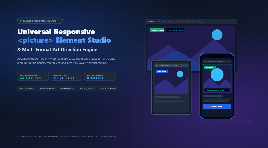
This in-depth guide examines the syntax, architectural precedence, and mathematical safeguards of the HTML5 <picture> element. We will explore how to construct next-generation format fallback cascades (AVIF $\to$ WebP $\to$ legacy JPEG/PNG), eliminate layout shifts with aspect-ratio enforcement, formulate high-DPI Retina descriptors, and streamline implementation using the Responsive HTML5 <picture> Element & Multi-Format Art Direction Studio on RiazHub.
⚡ Accelerate Your Responsive Workflow
Skip manual image cropping in photo editing suites and tedious manual markup writing. Generate standards-compliant <picture> code, transcode AVIF/WebP assets, and simulate live viewport behavior in real time.
1. The Fundamental Distinction: Resolution Switching vs. True Art Direction
To implement responsive media effectively, frontend architects must clearly distinguish between two fundamentally distinct responsive paradigms:
A. Resolution Switching (Density & Fluid Width)
In resolution switching, the visual composition, subject framing, and aspect ratio of the image remain completely identical across every device. The browser merely selects a higher or lower resolution file depending on screen pixel density (Device Pixel Ratio or DPR) or viewport width. This is the domain of <img srcset="..." sizes="...">.
B. True Art Direction (Compositional Adaptation)
In genuine art direction, the visual presentation intentionally adapts to the device geometry. A wide 16:9 hero graphic featuring a landscape with a central human subject becomes tiny, illegible, and lost when scaled down linearly onto a 375px mobile screen.
With the HTML5 <picture> element, developers can supply a dedicated 1:1 square or 4:5 vertical portrait crop centered directly on the human subject for mobile devices, while retaining the 16:9 widescreen composition for desktop monitors.
| Capability / Feature | Standard <img srcset> |
HTML5 <picture> Element |
|---|---|---|
| Resolution Density Multipliers (1x, 2x, 3x) | ✓ Supported | ✓ Supported |
| Format Cascading (AVIF $\to$ WebP $\to$ JPG) | Limited / Hacky | ✓ Native & Standards-Compliant |
| Different Aspect Ratios per Device (16:9 vs 1:1) | ✗ Impossible (Linear scaling only) | ✓ Native Art Direction |
| Independent Focal Point Anchoring per Breakpoint | ✗ Not Supported | ✓ Full Architectural Control |
| Browser Overrides | Browser heuristics decide file | Developer strictly dictates media queries |
2. Anatomical Blueprint of the Multi-Tier <picture> Element
The browser processes child <source> tags inside a <picture> wrapper strictly in top-to-bottom sequence. The first <source> element that satisfies both the type attribute (supported image format) and the media query condition is executed; all subsequent tags are ignored.
The fallback <img> tag at the bottom is mandatory: it is the actual rendering conduit in the DOM. Without the <img> element, nothing will be rendered.
<!-- Production-Ready Responsive <picture> Element -->
<picture class="responsive-hero-media">
  <!-- 1. Desktop Breakpoint (1024px+): High-Efficiency AVIF -->
  <source
    type="image/avif"
    media="(min-width: 1024px)"
    srcset="/uploads/hero-desktop.avif 1x, /uploads/hero-desktop@2x.avif 2x">

  <!-- 2. Mobile Art Crop Breakpoint (max 767px): AVIF 1:1 Square -->
  <source
    type="image/avif"
    media="(max-width: 767px)"
    srcset="/uploads/hero-mobile.avif 1x, /uploads/hero-mobile@2x.avif 2x">

  <!-- 3. Desktop Breakpoint (1024px+): Universal WebP -->
  <source
    type="image/webp"
    media="(min-width: 1024px)"
    srcset="/uploads/hero-desktop.webp 1x, /uploads/hero-desktop@2x.webp 2x">

  <!-- 4. Mobile Art Crop Breakpoint (max 767px): WebP 1:1 Square -->
  <source
    type="image/webp"
    media="(max-width: 767px)"
    srcset="/uploads/hero-mobile.webp 1x, /uploads/hero-mobile@2x.webp 2x">

  <!-- 5. Mandatory Fallback Default Raster (Zero CLS Shield) -->
  <img
    src="/uploads/hero-fallback.jpg"
    alt="Summer promo collection campaign banner"
    width="1200"
    height="675"
    loading="eager"
    fetchpriority="high"
    decoding="async"
    style="width: 100%; height: auto; aspect-ratio: 16 / 9; display: block;"
  />
</picture>
Notice the strict cascade order: AVIF is prioritized above WebP because AVIF offers 20% to 50% superior compression efficiency over WebP. If the visiting browser (such as modern Chrome, Safari 16+, or Firefox) supports AVIF, it picks the AVIF source. If not, it falls back to WebP. If an outdated legacy crawler or browser arrives, it smoothly falls back to the baseline <img> raster file.
You can synthesize this exact multi-stack cascade automatically with zero manual syntax errors using the RiazHub Responsive Picture Element Generator.
3. The Core Web Vitals Shield: Neutralizing Cumulative Layout Shift (CLS)
Historically, one of the most common pitfalls when deploying responsive <picture> elements was Cumulative Layout Shift (CLS). When a browser encounters an <img> without dimensions, it allocates 0 pixels of vertical space until the image header is downloaded and parsed. Once loaded, the page content violently shifts downward, creating an irritating user experience and directly penalizing your Core Web Vitals score.
Modern browsers compute default aspect ratios natively by examining the intrinsic HTML attributes:
aspect-ratio = width / height
By declaring explicit numeric width="1200" and height="675" attributes on the baseline <img> tag and complementing them with the CSS rule aspect-ratio: 16 / 9, the browser reserves the exact proportional box in the layout tree before a single image byte is downloaded over the network.
Handling Multiple Aspect Ratios Across Breakpoints
When engaging in genuine art direction (e.g., a 16:9 aspect ratio on desktop vs. a 1:1 square ratio on mobile), developers should pair media queries in CSS with the picture element to adjust the container’s aspect-ratio property accordingly:
.responsive-hero-media img {
  width: 100%;
  height: auto;
  aspect-ratio: 16 / 9; /* Desktop Baseline */
  display: block;
}

@media (max-width: 767px) {
  .responsive-hero-media img {
    aspect-ratio: 1 / 1; /* Mobile Square Art Crop */
  }
}
When the mobile viewport is parsed, the CSS media query overrides the aspect-ratio instantly to 1:1, guaranteeing a flawless 0.00 CLS score even across mobile screen orientations.
4. Next-Gen Format Benchmark: AVIF vs. WebP vs. JPEG
Understanding compression mechanics is critical when defining your target format matrix:
- AV1 Image File Format (AVIF): Derived from the open-source AV1 video codec by the Alliance for Open Media (AOMedia). Supports 10-bit and 12-bit color depth, HDR, lossy and lossless compression. Yields files approximately 30% smaller than WebP and 50% smaller than legacy JPEG at visually indistinguishable quality levels.
- WebP: Developed by Google, WebP has achieved near-universal support across all modern browsers (97%+ global market share). It provides superior compression to standard JPEG while supporting 8-bit alpha transparency.
- Legacy JPEG / PNG Fallback: Remains vital for backwards compatibility with legacy email clients, legacy web scrapers, and older web rendering engines.
Rather than manually converting three versions of every breakpoint crop in desktop graphics software, the Universal Responsive HTML5 <picture> Studio provides in-browser client-side transcoding, processing AVIF, WebP, and JPEG variations simultaneously using local Canvas hardware acceleration.
5. Strategic Asset Placement: Above-the-Fold (Hero) vs. Below-the-Fold
Applying identical loading attributes across all images on a page is a critical performance error. Your loading strategy must mirror the viewport priority:
A. Above-the-Fold Hero Graphics (LCP Optimization)
loading="eager": Tells the browser not to defer image loading.fetchpriority="high": Elevates the network request priority in the browser’s download queue so the hero image beats non-critical scripts and stylesheets.decoding="async": Prevents the image decoding process from blocking the main JavaScript execution thread.
B. Below-the-Fold In-Content Graphics
loading="lazy": Defers fetching the image bytes until the user scrolls within a calculated threshold of the image.fetchpriority="low": Yields bandwidth to critical network assets.decoding="async": Offloads rasterization to worker threads.
6. Step-by-Step Walkthrough: Using the RiazHub Responsive <picture> Studio
To streamline this entire technical workflow into a matter of seconds, RiazHub engineers developed the browser-based Responsive HTML5 <picture> Element & Multi-Format Art Direction Studio. Here is how to utilize it in your daily production pipeline:
- Load Master Graphic: Drag and drop your high-resolution master asset (up to 4K resolution in JPG, PNG, WEBP, or AVIF) into the upload dropzone, or paste directly from your clipboard using
Ctrl+V. - Select Quick Preset Profile: Choose from pre-configured engineering presets such as “Hero LCP Booster” (AVIF + WebP with eager high-priority loading and 16:9 desktop to 4:5 mobile art crops) or “Blog In-Content Standard”.
- Configure Dynamic Breakpoint Stack: Define custom media query breakpoints (e.g.
min-width: 1024pxfor desktop,min-width: 768pxfor tablet, andmax-width: 767pxfor mobile). Customize independent aspect ratios (16:9, 4:3, 1:1, 4:5, 21:9) and set focal alignment anchors (Center, Top, Bottom) to protect the primary visual subject. - Test with the Live Multi-Device Simulator: Slide the interactive 60 FPS viewport bar from 320px to 1920px. Watch the live telemetry HUD confirm which
<source>rule and format is selected at each exact pixel width. - Export Production Bundles: Instantly copy semantic HTML5 markup, drop-in WordPress PHP shortcodes, or React/Next.js components. Click “Download Code & Asset Bundle (.zip)” to download an in-memory generated ZIP archive containing all converted AVIF, WebP, and JPEG crops alongside the HTML preview file.
🛠️ Try the Tool Now
Experience zero-latency, 100% private in-browser image transcoding and responsive code synthesis directly on RiazHub.
7. Multi-Target Production Code Exporters
A. WordPress Drop-In Shortcode & Filter Function
If you are developing a custom WordPress child theme or maintaining a high-performance content site on RiazHub.com, you can drop this reusable shortcode function directly into your functions.php file:
/**
 * High-Performance Responsive <picture> Element Shortcode
 * Usage: [custom_picture slug="hero-banner" alt="Summer Promo" class="my-hero"]
 */
if (!function_exists('riazhub_render_responsive_picture')) {
    function riazhub_render_responsive_picture($atts) {
        $a = shortcode_atts([
            'slug'  => 'hero-banner',
            'alt'   => 'Promotional Graphic',
            'class' => 'responsive-picture-hero',
            'path'  => '/wp-content/uploads/banners/',
            'hero'  => 'true'
        ], $atts);

        $path = trailingslashit($a['path']);
        $slug = sanitize_file_name($a['slug']);
        $alt  = esc_attr($a['alt']);
        $class= esc_attr($a['class']);
        $is_hero = filter_var($a['hero'], FILTER_VALIDATE_BOOLEAN);

        $loading  = $is_hero ? 'loading="eager"' : 'loading="lazy"';
        $priority = $is_hero ? 'fetchpriority="high"' : 'fetchpriority="low"';

        ob_start(); ?>
        <picture class="<?php echo $class; ?>">
            <!-- AVIF Sources -->
            <source type="image/avif" media="(min-width: 1024px)" srcset="<?php echo esc_url($path . $slug . '-desktop.avif'); ?> 1x, <?php echo esc_url($path . $slug . '-desktop@2x.avif'); ?> 2x">
            <source type="image/avif" media="(max-width: 768px)" srcset="<?php echo esc_url($path . $slug . '-mobile.avif'); ?> 1x, <?php echo esc_url($path . $slug . '-mobile@2x.avif'); ?> 2x">

            <!-- WebP Sources -->
            <source type="image/webp" media="(min-width: 1024px)" srcset="<?php echo esc_url($path . $slug . '-desktop.webp'); ?> 1x, <?php echo esc_url($path . $slug . '-desktop@2x.webp'); ?> 2x">
            <source type="image/webp" media="(max-width: 768px)" srcset="<?php echo esc_url($path . $slug . '-mobile.webp'); ?> 1x, <?php echo esc_url($path . $slug . '-mobile@2x.webp'); ?> 2x">

            <!-- Default Raster Fallback -->
            <img
                src="<?php echo esc_url($path . $slug . '-desktop.jpg'); ?>"
                alt="<?php echo $alt; ?>"
                width="1200"
                height="675"
                <?php echo $loading; ?>
                <?php echo $priority; ?>
                decoding="async"
                style="width: 100%; height: auto; aspect-ratio: 16 / 9; display: block;"
            />
        </picture>
        <?php
        return ob_get_clean();
    }
    add_shortcode('custom_picture', 'riazhub_render_responsive_picture');
}
B. React / Next.js TypeScript Component
For modern React, Next.js, and headless storefront architectures, the component maps sources seamlessly with native JSX props:
import React from 'react';

interface ResponsivePictureProps {
  slug?: string;
  alt?: string;
  className?: string;
  basePath?: string;
  isHero?: boolean;
}

export const ResponsivePicture: React.FC<ResponsivePictureProps> = ({
  slug = 'hero-banner',
  alt = 'Responsive Graphic',
  className = 'responsive-picture-hero',
  basePath = '/assets/images/',
  isHero = true
}) => {
  const cleanPath = basePath.replace(/\/+$/, '') + '/';

  return (
    <picture className={className}>
      {/* AVIF Next-Gen Source Stack */}
      <source
        type="image/avif"
        media="(min-width: 1024px)"
        srcSet={`${cleanPath}${slug}-desktop.avif 1x, ${cleanPath}${slug}-desktop@2x.avif 2x`}
      />
      <source
        type="image/avif"
        media="(max-width: 768px)"
        srcSet={`${cleanPath}${slug}-mobile.avif 1x, ${cleanPath}${slug}-mobile@2x.avif 2x`}
      />

      {/* WebP Source Stack */}
      <source
        type="image/webp"
        media="(min-width: 1024px)"
        srcSet={`${cleanPath}${slug}-desktop.webp 1x, ${cleanPath}${slug}-desktop@2x.webp 2x`}
      />
      <source
        type="image/webp"
        media="(max-width: 768px)"
        srcSet={`${cleanPath}${slug}-mobile.webp 1x, ${cleanPath}${slug}-mobile@2x.webp 2x`}
      />

      {/* Fallback Raster with CLS Shield */}
      <img
        src={`${cleanPath}${slug}-desktop.jpg`}
        alt={alt}
        width={1200}
        height={675}
        loading={isHero ? 'eager' : 'lazy'}
        fetchPriority={isHero ? 'high' : 'low'}
        decoding="async"
        style={{
          width: '100%',
          height: 'auto',
          aspectRatio: '16 / 9',
          display: 'block'
        }}
      />
    </picture>
  );
};

export default ResponsivePicture;
8. Summary Checklist for High-Performance Picture Elements
Before deploying your responsive images to production, verify each item against this Core Web Vitals checklist:
- Hierarchy Ordering: Are modern formats stacked in order of compression efficiency (AVIF first, then WebP, then JPEG/PNG)?
- Media Query Sequencing: Are
min-widthqueries sequenced from largest to smallest, ormax-widthqueries sequenced from smallest to largest? - CLS Prevention: Does the fallback
<img>declare explicitwidthandheightattributes, paired with modern CSSaspect-ratio? - LCP Prioritization: If the asset resides Above-the-Fold, did you set
loading="eager"andfetchpriority="high"? - Bandwidth Economy: Did you generate
2xRetina density descriptors only for screen breakpoints where high density delivers noticeable fidelity enhancements?
By mastering the HTML5 <picture> element, you unlock the pinnacle of responsive visual design: serving lightweight, beautifully cropped art assets tailored precisely to every user’s device while safeguarding your Core Web Vitals scores.
Ready to transform your visual assets? Launch the Universal Responsive HTML5 <picture> Element & Multi-Format Art Direction Studio on RiazHub to automate your entire responsive pipeline directly in your browser.
Universal Responsive <picture> & Multi-Format Art Direction Studio
Synthesize standards-compliant HTML5 <picture> elements with AVIF & WebP fallbacks, configure responsive art direction crop breakpoints, guarantee zero Cumulative Layout Shift (CLS), simulate live device rendering, and export complete production code & image bundles in-browser.
| Target File | Format | Breakpoint Target | Dimensions | Density | Type |
|---|
🎨 True Art Direction vs. <img srcset>
While standard <img srcset> only advises the browser on resolution density for identical crops, the HTML5 <picture> element allows web engineers to enforce distinct aspect ratios (e.g., 16:9 cinematic widescreen on desktop vs. 4:5 or 1:1 square crop on mobile), guaranteeing focal clarity across all screen sizes.
🛡️ Zero Cumulative Layout Shift (CLS 0.00)
Modern browsers allocate spatial layout before media files finish loading by calculating width / height. By injecting explicit fallback pixel dimensions and pairing with CSS aspect-ratio, our generator guarantees zero layout shift penalty, securing top Google PageSpeed & Core Web Vitals rankings.
⚡ Next-Gen Multi-Tier Compression Cascade
AVIF provides up to 50% higher compression efficiency than JPEG, while WebP provides universal modern browser coverage. Stacking AVIF first, then WebP, and finally a standard JPEG/PNG guarantees every visitor receives the smallest possible file their browser natively supports.
🔒 100% Client-Side Privacy & Zero Latency
All image scaling, crop rendering, format transcoding, and ZIP file packing occurs directly in your local browser engine using HTML5 Canvas and in-memory byte generation. No photos or code are ever transmitted to an external server.