
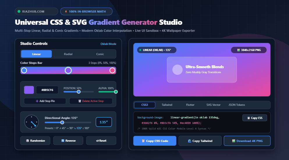
The Complete Guide to Modern CSS & SVG Gradients: Oklab Color Physics, Multi-Stop Composition & Multi-Platform Asset Generation
Explore how modern color models eliminate muddy middle dead zones, master trigonometric angle calculations, and streamline production workflows with live UI mockups and instant 4K wallpaper exports.
With the formal standardization of the CSS Color Module Level 4 and the universal adoption of the Oklab and Oklch perceptual color spaces across evergreen browsers, frontend engineers finally possess the mathematical tools to generate photorealistic, buttery-smooth color transitions. To eliminate tedious manual calculations and vendor syntax fragmentation, RiazHub developed the free Universal CSS & SVG Gradient Generator Studio, an entirely browser-based workspace designed to compile multi-stop linear, radial, and conic gradients in real time.
You can design, test, and export modern CSS3, Tailwind, Flutter, SVG, and high-resolution 4K wallpaper files directly in your browser without installing external software using the CSS & SVG Gradient Generator Studio at RiazHub.
1. The Mathematics of Color Spaces: Why sRGB Fails and How Oklab Solves It
To understand why gradients look lifeless in standard CSS, one must look at how digital screens mix light. The traditional sRGB color space is non-linear and mathematically engineered around physical cathode-ray tube (CRT) display phosphors rather than the complex optical biology of the human eye.
When a browser computes intermediate color stops using standard linear RGB interpolation, it computes the raw numerical arithmetic average of red, green, and blue components. Because human photoreceptors perceive changes in green and yellow luminance much more intensely than changes in blue or violet, calculating midpoints in non-uniform color spaces causes intermediate colors to collapse toward an unappealing grayish mud.
The Oklab color space, engineered by color scientist Björn Ottosson in 2020 and subsequently adopted by the W3C, is a perceptually uniform color model. In Oklab:
- L (Lightness): Represents perceived brightness independent of chroma.
- a (Green-Red Axis): Balances opposing chromatic values across the green/magenta spectrum.
- b (Blue-Yellow Axis): Balances opposing chromatic values across the blue/yellow spectrum.
Because perceived lightness and chroma are completely decoupled from hue, interpolating across Oklab ensures that the perceived luminosity remains constant across the entire gradient curve. By selecting Oklab inside the RiazHub CSS & SVG Gradient Generator Studio, the CSS engine appends the modern in oklab keyword directly into your rule:
/* Standard sRGB (Creates Dull Gray Transition) */
background-image: linear-gradient(135deg, #3b82f6 0%, #ec4899 100%);

/* Modern W3C Oklab Interpolation (Vibrant & Perceptually Uniform) */
background-image: linear-gradient(in oklab 135deg, #3b82f6 0%, #ec4899 100%);
2. Geometry & Trigonometry: Linear, Radial, and Conic Gradients
Modern web development supports three distinct architectural families of gradients. Each solves distinct visual hierarchy and UI surface challenges:
| Gradient Type | Coordinate System | Key Parameters | Recommended UI Use Case |
|---|---|---|---|
| Linear | Directional Axis Vector | Angle ($0^\circ$ to $360^\circ$), Multi-Stops | Hero headers, primary CTA buttons, cards, headers |
| Radial | Focal Point to Periphery | Shape (Circle/Ellipse), Origin ($X, Y$), Extent | Ambient spotlight glows, dark mode vignettes, depth |
| Conic | Polar Angle Sweep ($360^\circ$) | Start Angle, Center Pivot Coordinate | Circular progress meters, holographic sheens, pie charts |
Linear Vector Trigonometry
In CSS, an angle of 0deg points directly upward (bottom-to-top), while 90deg points toward the right. Under the hood, the browser creates an angle vector defined by:
x1 = 50% - (cos(θ) × 50%)
y1 = 50% - (sin(θ) × 50%)
x2 = 50% + (cos(θ) × 50%)
y2 = 50% + (sin(θ) × 50%)
Inside the online gradient studio, you can control this vector interactively using a tactile 360° rotational compass dial, direct degree inputs, or an 8-way directional arrow grid for instantaneous angle snapping.
Radial Focal Points & Shape Selection
Radial gradients expand outward from a single coordinate. You can specify whether the progression maintains a strict equidistant radius (circle) or stretches to conform to rectangular parent dimensions (ellipse). Positioning the focal center at coordinates like top left or center allows you to create subtle illumination effects that simulate physical light sources shining across a digital dashboard.
Conic (Sweep) Gradients
Unlike radial gradients that emit color outward, conic gradients wrap colors around a central pivot point in a clockwise sweep much like the colors distributed across an artist’s color wheel. Conic gradients are ideal for futuristic iridescent overlays, futuristic cyber-aesthetic card borders, and data visualization rings.
3. Mastering Multi-Stop Composition on an Interactive Gradient Track
A high-end gradient rarely consists of just two stops. Professional product designers frequently blend three, four, or five color stops with nuanced position offsets and alpha transparency to create realistic depth, metallic lusters, or soft glassmorphic textures.
When utilizing the interactive slider inside the CSS & SVG Gradient Generator Studio, designers can leverage several tactile controls:
- Single-Click Track Addition: Click anywhere directly on the visual gradient track to insert an active stop at that exact percentage offset ($0\%$ to $100\%$).
- Draggable Marker Pins: Drag pins smoothly across touchscreens or desktop displays with real-time CSS property recalculation.
- Double-Click Removal: Double-click any marker pin (or click the active trash icon) to remove excess stops, with built-in safety preserving a minimum of two primary stops.
- Independent Alpha / Opacity Channels: Each stop features dedicated opacity adjustments ($0\%$ to $100\%$) converted into clean
rgba()syntax for seamless frosted-glass overlay stacking.
By placing two distinct color stops at the exact same percentage (e.g., Stop A at #3b82f6 50% and Stop B at #ec4899 50%), you can create razor-sharp split-diagonal backgrounds and geometric patterns without relying on separate image files or SVG dividers.
4. Real-World UI Mockup Sandbox: Testing Visual Balance Before Deployment
A common challenge frontend developers face is that a gradient that looks stunning across a massive standalone canvas can fail dramatically when applied to smaller user interface elements. Small text can become unreadable, buttons may lack contrast, and complex glassmorphic cards can look garish.
To address this, the CSS & SVG Gradient Generator Studio includes an integrated UI Mockup Sandbox that applies your active palette simultaneously across four real-world interface patterns:
- Hero Header Banners: Verifies how white typography and primary call-to-action buttons contrast against high-luminance sections.
- Glassmorphic Cards: Tests backdrop blur filters (
backdrop-filter: blur(14px)) and semi-transparent white borders atop your gradient background. - Mobile Application Viewports: Evaluates how color density balances on vertical smartphone aspect ratios alongside status bars and fitness tracking metrics.
- Interactive Micro-Action Buttons: Previews tactile button hover animations and glow effects when applied to interactive elements.
5. Multi-Platform Export Pipelines: CSS, Tailwind, Flutter, SVG & JSON
Modern development stacks rarely consist of vanilla CSS alone. Cross-functional teams frequently need to distribute identical gradient palettes across web frontends, mobile applications, vector design tools, and centralized design systems.
The RiazHub Gradient Tool automates this conversion instantly across five production-grade syntax specifications:
1. Production CSS3 (With Legacy Client Fallbacks)
Provides solid color fallbacks for legacy email renderers (like Outlook) alongside standard sRGB fallbacks before invoking modern Oklab rules:
.gradient-bg {
  /* Fallback solid background */
  background-color: #3b82f6;

  /* Standard fallback gradient */
  background-image: linear-gradient(135deg, #3b82f6 0%, #8b5cf6 50%, #ec4899 100%);

  /* Modern OKLAB Perceptual Gradient */
  background-image: linear-gradient(in oklab 135deg, #3b82f6 0%, #8b5cf6 50%, #ec4899 100%);
}
2. Tailwind CSS Arbitrary Class Syntax
Tailwind v3+ supports arbitrary values. The tool escapes spaces automatically into underscores, allowing you to paste clean utilities straight into your JSX or HTML templates:
<div class="bg-[linear-gradient(in_oklab_135deg,#3b82f6_0%,_#8b5cf6_50%,_#ec4899_100%)] w-full h-64 rounded-xl shadow-lg">
  <!-- Content -->
</div>
3. Flutter Native Mobile Syntax
Compiles Dart BoxDecoration objects with 32-bit ARGB hex color declarations for cross-platform iOS and Android applications:
BoxDecoration(
  gradient: LinearGradient(
    begin: Alignment.topLeft,
    end: Alignment.bottomRight,
    colors: [Color(0xFF3B82F6), Color(0xFF8B5CF6), Color(0xFFEC4899)],
    stops: [0.00, 0.50, 1.00],
  ),
)
4. Scalable Vector Graphics (SVG Vector File)
Compiles complete W3C XML vector code incorporating <linearGradient> or <radialGradient> tags and auto-calculated vector coordinates, ready to download as a standalone .svg file or paste directly into Figma or Adobe Illustrator.
5. Design Token JSON
Produces machine-readable JSON tokens compatible with Figma Tokens, Style Dictionary, and enterprise design system pipelines.
6. Client-Side 4K Wallpaper Generation via HTML5 Canvas Pipeline
Beyond interface styling, high-resolution gradient wallpapers are among the most popular aesthetic elements for desktop backdrops, video conferencing backgrounds, and brand presentation decks.
Rather than relying on raster graphics generated on remote web servers, the CSS & SVG Gradient Generator Studio utilizes an in-browser HTML5 Canvas pipeline. When you click “Download Wallpaper (4K PNG)”:
- An offscreen
<canvas>element is dynamically allocated at true 4K resolution (3840 × 2160 pixels). - The vector angle trigonometry or radial focal radius is recalculated to match the 16:9 canvas dimensions.
- The 2D rendering context rasterizes all stops and opacity channels in 24-bit RGBA color.
- A raw binary
Blobis synthesized directly in local memory and triggered as a browser download viaURL.createObjectURL.
Because this process happens entirely on the client side, your custom color palettes, brand assets, and generated wallpapers are processed locally on your machine with complete privacy.
7. Curated Palettes: Handpicked Harmonies for Modern Design Systems
Designing compelling palettes from scratch can be time-consuming. The studio features a curated library of over 24 handpicked gradient presets that can be loaded with a single click:
- SaaS Electric: Deep indigo (
#4f46e5) transitioning into electric violet and magenta for modern technology landing pages. - Sunset Glow: Warm marigold amber radiating into crimson coral and rich berry for welcoming, energetic brands.
- Deep Ocean Abyss: Concentric radial navy and cyan shades designed for sleek dark-mode dashboards.
- Aurora Borealis: Nordic emerald greens blending through cyan into periwinkle blue via Oklch interpolation.
- Retro Synthwave: Deep ultraviolet shifting through neon pink into amber dusk.
You can load any of these curated presets, adjust stop positions, toggle color interpolation spaces, and immediately export them into your codebase using the free online gradient studio.
8. Frequently Asked Questions (FAQ)
Is Oklab gradient interpolation supported in all browsers?
Yes. Modern CSS interpolation syntax (linear-gradient(in oklab, ...)) is fully supported across all evergreen desktop and mobile browsers, including Google Chrome 111+, Apple Safari 16.2+, and Mozilla Firefox 113+. For legacy clients and older WebViews, the RiazHub Gradient Generator automatically outputs fallback standard gradient syntax.
How do I create smooth glassmorphism gradient cards?
To create an authentic glassmorphic card, generate a 2-stop linear gradient using pure white (#ffffff), setting the first stop at approximately 25% to 40% opacity and the second stop at 5% to 10% opacity. Apply a CSS backdrop-filter: blur(16px) and a subtle 1px border with rgba(255, 255, 255, 0.3).
Does the tool upload my design palettes or images to a server?
No. The entire application runs 100% inside your client browser using vanilla JavaScript and HTML5 Canvas APIs. Zero parameters, palette codes, or downloaded 4K PNG wallpapers are ever transmitted to an external server.
Universal CSS & SVG Gradient Generator
Craft ultra-smooth linear, radial, and conic gradients with modern Oklab color interpolation, live UI component previews, and multi-format code export in real time.
📘 CSS Gradient Math, Color Theory & Oklab Guide
linear-gradient(in oklab, ...)), the browser computes transitions in a perceptually uniform space where lightness and chroma are preserved naturally, resulting in vibrant, photorealistic gradients without dull middle colors.
- Linear Gradients: Radiate color along a directional axis defined by degrees or directions. Ideal for hero section backgrounds, primary call-to-action buttons, and cards.
- Radial Gradients: Originate outward from a center focal point in circular or elliptical geometry. Best suited for subtle spotlight illumination, ambient glows, and dark-mode backdrop vignettes.
- Conic Gradients: Rotate color transitions around a central 360° pivot (like colors on a color wheel). Perfect for circular progress indicators, holographic sheen effects, metallic finishes, and pie charts.
in oklab are supported in all evergreen browsers (Chrome 111+, Safari 16.2+, Firefox 113+). For legacy clients, such as older WebViews or HTML email rendering engines (Outlook/Thunderbird), our code exporter provides standard solid color fallback rules (background-color: #hex) and standard sRGB fallback declarations so your UI never renders blank.