
Mastering Image Aspect Ratios: The Complete Guide to Dimensions, Euclidean GCD Mathematics, and Social Media Safe-Zones
Yet, creators and web developers constantly struggle with questions like: Why did Instagram crop the top of my portrait photo? What is the exact ratio of a 1920×1080 pixel canvas? How can I solve missing dimensions without stretching my graphics?
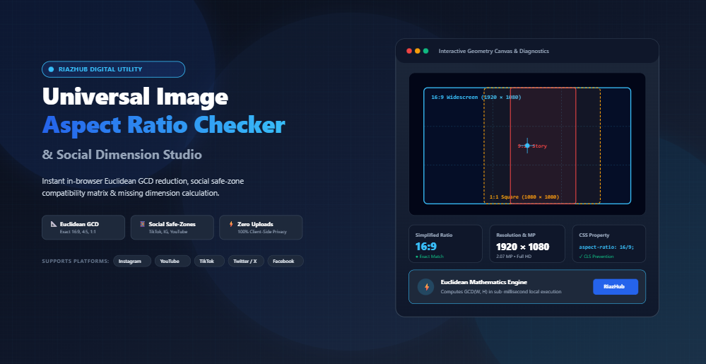
To eliminate this guesswork, we engineered the Universal Image Aspect Ratio Checker & Social Dimension Studio. In this comprehensive guide, we will break down the exact mathematics of aspect ratios, explore the Euclidean GCD algorithm, provide a safe-zone cheat sheet for every major platform, and demonstrate how proper aspect ratio declarations protect your website against Google’s Cumulative Layout Shift (CLS).
What Is an Aspect Ratio? (Dimensions vs. Proportions)
An aspect ratio represents the proportional relationship between the width and height of an image or digital screen. It is universally expressed as two numbers separated by a colon (Width : Height), such as 16:9, 4:3, or 1:1.
It is vital to distinguish between resolution and aspect ratio:
- Pixel Resolution (Absolute Size): Tells you the total pixel count (e.g.,
1920×1080 pxor3840×2160 px). - Aspect Ratio (Relative Proportion): Tells you the geometric shape. Both 1920×1080 and 3840×2160 share the exact same 16:9 widescreen proportion.
When you drop any image into the in-browser aspect ratio calculator, the tool immediately extracts the native width and height from the image headers without sending your private files over the network.
The Mathematics: How the Euclidean GCD Algorithm Simplifies Raw Coordinates
How does a calculator convert raw coordinates like 2560 × 1440 into 16:9? Direct floating-point division (2560 / 1440 = 1.777777…) produces infinite decimals that are unhelpful for responsive layouts. Instead, mathematicians use the centuries-old Euclidean Algorithm to find the Greatest Common Divisor (GCD).
The Euclidean GCD Step-by-Step
The Euclidean algorithm works by repeatedly replacing the larger number by the remainder of dividing the larger number by the smaller number until the remainder equals zero:
function calculateGcd(a, b) {
    while (b) {
        let remainder = a % b;
        a = b;
        b = remainder;
    }
    return a;
}
Let’s trace 1920 × 1080:
- 1920 ÷ 1080 = 1 with a remainder of 840
- 1080 ÷ 840 = 1 with a remainder of 240
- 840 ÷ 240 = 3 with a remainder of 120
- 240 ÷ 120 = 2 with a remainder of 0
The Greatest Common Divisor is 120. Dividing both dimensions by 120 gives:
- 1920 ÷ 120 = 16
- 1080 ÷ 120 = 9
Result: An irreducible fractional ratio of 16:9. You can verify any custom resolution using our free Image Aspect Ratio Checker tool.
Universal Social Media Aspect Ratio & Safe-Zone Matrix
Every social media network enforces strict aspect ratios. Uploading the wrong proportions causes automated cropping or unsightly black letterbox bars. Here is your definitive master checklist:
| Platform & Format | Aspect Ratio | Recommended Resolution | Key Safe-Zone Recommendation |
|---|---|---|---|
| Instagram Square Feed | 1:1 |
1080 × 1080 px | Classic grid standard; 100% visible on all profiles. |
| Instagram Portrait Post | 4:5 |
1080 × 1350 px | Optimal for feed engagement; occupies maximum vertical screen height. |
| TikTok, IG Reels & Shorts | 9:16 |
1080 × 1920 px | Keep vital text within central 1080×1420 px to avoid UI buttons and captions. |
| YouTube Video Thumbnail | 16:9 |
1280 × 720 / 1920 × 1080 px | Avoid important text in the bottom right corner (covered by time stamp badge). |
| Facebook & X OpenGraph Card | 1.91:1 |
1200 × 630 px | Universal web link thumbnail standard for social shares. |
| Pinterest Vertical Pin | 2:3 |
1000 × 1500 px | Longer ratios risk being truncated in multi-column mobile feeds. |
| YouTube Channel Banner | 16:9 |
2560 × 1440 px | Keep core branding inside central 1546 × 423 px desktop safe-zone. |
Before publishing social assets, inspect them on the Social Dimension Studio to visually simulate desktop, iPad, and mobile viewports with full safe-zone overlays.
Core Web Vitals: Why CSS aspect-ratio Stops Cumulative Layout Shift (CLS)
Google evaluates web pages based on user-centric performance signals known as Core Web Vitals. One of the most heavily weighted metrics is Cumulative Layout Shift (CLS), which measures how much content unexpectedly jumps around during page loading.
The Problem with Legacy Responsive Images
Historically, responsive stylesheets styled images with width: 100%; height: auto;. Because browsers could not determine the image’s height until the binary file finished downloading, the image initially occupied 0 pixels of height. When the file arrived, the page suddenly snapped down, frustrating users and devastating your search ranking.
The Modern Solution: CSS aspect-ratio
Modern CSS introduced the native aspect-ratio property. By defining the ratio in CSS or specifying inline HTML attributes, the browser immediately calculates the exact proportional bounding box before a single byte of image data streams:
/* Pure Modern CSS */
.responsive-card-img {
    width: 100%;
    aspect-ratio: 16 / 9;
    object-fit: cover;
}
Or in Tailwind CSS:
<img class="w-full aspect-[16/9] object-cover" src="hero.webp" alt="Hero banner">Whenever you test an image inside our Universal Image Aspect Ratio Checker, the tool automatically generates ready-to-paste CSS, Tailwind, and HTML responsive tags with CLS prevention built right in.
Solving Missing Dimensions Without Image Distortion
Have you ever needed to resize an image to fit a standard 16:9 video frame or 4:5 Instagram canvas, but were unsure what height corresponded to your width? Guessing numbers causes images to look squished or stretched.
The mathematical formulas to solve missing coordinates are straightforward:
- To find missing Height:
Height = Width ÷ Decimal Ratio - To find missing Width:
Width = Height × Decimal Ratio
For example, if you want a 16:9 banner (decimal ratio ≈ 1.778) with a width of 1440 pixels: 1440 ÷ 1.777777 = 810 px. Your target dimensions are 1440 × 810 px.
Rather than doing manual math, you can use the built-in Missing Dimension Solver inside the RiazHub Aspect Ratio Utility to calculate and lock target ratios with one click.
Step-by-Step: How to Use the RiazHub Aspect Ratio Checker
- Load Your Media: Drag and drop up to 20 images (PNG, JPG, WebP, AVIF, SVG, or GIF) into the uploader, or click “Load Demo Photo” to test instantly.
- Inspect Diagnostics: Check the 4-Card Overview for simplified Euclidean ratio, exact megapixels, display category (4K UHD, Full HD, 720p), and orientation.
- Audit Social Compatibility: Switch to the “Social Matrix” tab to verify if your image qualifies for Instagram, YouTube, TikTok, Facebook, or Pinterest.
- Test Real Devices: Navigate to the “Device Viewport” tab to preview your image inside Desktop monitors, iPad screens, and vertical mobile smartphones.
- Export Developer Tokens & Reports: Copy pure CSS or Tailwind tokens, or download full batch audits in CSV or JSON format.
Frequently Asked Questions (FAQ)
Are my uploaded images stored on RiazHub servers?
No. The Universal Image Aspect Ratio Studio operates 100% client-side inside your browser using HTML5 File and Image APIs. Zero photos, client assets, or metadata are ever transmitted to any remote server.
What is the difference between 16:9 and 1.91:1?
A 16:9 ratio has a decimal value of approximately 1.78:1 (e.g., 1920×1080), which is the standard for television, YouTube, and horizontal video. A 1.91:1 ratio has a decimal value of 1.91:1 (e.g., 1200×630) and is slightly wider, specifically engineered for OpenGraph link previews on Facebook, LinkedIn, and X.
What is the optimal aspect ratio for Instagram posts in 2026?
While 1:1 square (1080×1080 px) remains supported, the optimal ratio for organic engagement is 4:5 Portrait (1080×1350 px). It occupies over 25% more vertical screen real estate on mobile devices compared to square posts, significantly boosting dwell time and tap-through rates.
Universal Image Aspect Ratio Checker & Social Dimension Studio
Detect exact image dimensions, calculate simplified Euclidean ratios, audit social media safe-zones, and solve missing width/height coordinates in real time.
| File | Resolution | Ratio | MP | Orientation | Standard Match | Action |
|---|---|---|---|---|---|---|
| No batch images loaded. Drop multiple images in the Upload tab. | ||||||
📖 Aspect Ratio Engineering & Social Safe-Zones Guide
An aspect ratio represents the proportional relationship between an image's width and its height. For arbitrary resolutions like 1920 × 1080, dividing both numbers directly can result in unwieldy floating-point numbers.
The Euclidean Algorithm solves this with mathematical elegance by finding the Greatest Common Divisor (GCD) of both integers using successive remainder operations: gcd(a, b) = gcd(b, a mod b) until the remainder reaches zero.
For example, gcd(1920, 1080) = 120. Dividing 1920 and 1080 by 120 yields the irreducible fraction 16:9 with zero approximation error.
Google's Cumulative Layout Shift (CLS) metric penalizes websites whenever page layouts jump or shift while media files are streaming over the network. Historically, browsers couldn't compute the height of an image until the file header finished downloading.
By declaring explicit dimensions (width="1920" height="1080") or using the CSS aspect-ratio: 16 / 9; property, modern rendering engines immediately reserve the exact proportional bounding box in the DOM before the image payload arrives. This prevents layout shifting and achieves a perfect 100/100 Core Web Vitals score.
While vertical videos use a standard 9:16 (1080 × 1920 px) resolution, interactive user interface overlays obscure substantial portions of the screen:
• Top Safe-Zone: The top 150px is often covered by search bars, following/for-you navigation tabs, and system status bars.
• Bottom Safe-Zone: The bottom 250–320px contains the creator username, caption text, sound track metadata, and comment bars.
• Right Rail Safe-Zone: The right 120px hosts like, comment, bookmark, and share icons.
Always place your primary subjects, logos, subtitles, and call-to-action buttons inside the central safe canvas area indicated by the Visual Stage overlay.
Every calculation, image inspection, SVG generation, and report export performed in this studio executes 100% locally inside your web browser using client-side JavaScript APIs (HTMLImageElement, FileReader, Blob, and URL.createObjectURL).
Zero images, unreleased graphic assets, private photographs, or client metadata are ever transmitted to external servers, cloud databases, or remote endpoints. You can even disconnect your internet connection and inspect images completely offline.