
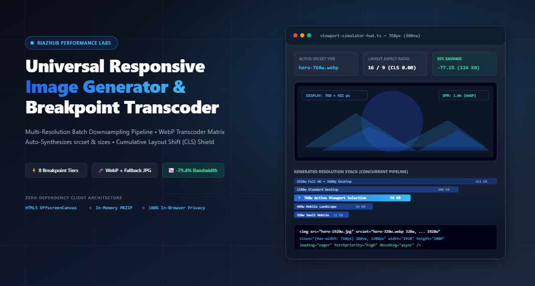
A comprehensive architectural manual for frontend engineers, WordPress developers, and performance specialists seeking sub-second Largest Contentful Paint (LCP) and zero Cumulative Layout Shift (CLS).
1. The Core Web Vitals Crisis: Why Hero Images Cripple Modern Websites
In the modern web landscape, over 62% of global web traffic originates from handheld mobile devices connected via fluctuating cellular 4G/5G connections. Yet, performance audits consistently reveal that the single largest contributor to failed Google PageSpeed Insights tests and high bounce rates is the oversized un-scaled desktop hero image.
When a content creator uploads a crisp 2400 × 1600 px master banner (often weighing between 1.5 MB and 4.2 MB) into a CMS, desktop users on Gigabit fiber may barely notice a hiccup. However, when a visitor lands on that same URL via a smartphone with a 375 × 667 px viewport:
- Cellular Network Saturation: The client’s mobile radio must download millions of redundant binary bytes that their physical screen lacks the hardware pixels to render.
- Catastrophic Largest Contentful Paint (LCP): The browser’s main render thread stalls while streaming multi-megabyte payloads, dragging LCP times beyond Google’s strict 2.5-second “Good” threshold into the penalizing > 4.0-second “Poor” category.
- CPU Thermal & Memory Penalty: Once downloaded, the mobile GPU must allocate substantial RAM to decode an enormous bitmap, draining battery life and triggering scrolling stutter (Input Delay / INP).
The Core Web Vitals Rule
Serving a desktop-dimensioned 1920px image to a 375px mobile viewport wastes up to 85% of transferred cellular bandwidth. The solution is not manual single-image compression, but an automated multi-resolution breakpoint delivery pipeline.
2. Demystifying srcset and sizes: How Browsers Negotiate Image Selection
HTML5 introduced native responsive image primitives designed to delegate the decision-making process directly to the browser client. Rather than hardcoding fixed pixel dimensions into an <img src="...">, modern responsive architecture uses a synchronized pair of attributes: srcset and sizes.
The Mechanics of srcset (Width Descriptors)
The srcset attribute provides the browser engine with an inventory of available resized image files accompanied by their physical pixel width descriptors (denoted by w, rather than px):
<img
  src="/images/hero-1280w.jpg"
  srcset="
    /images/hero-320w.webp 320w,
    /images/hero-480w.webp 480w,
    /images/hero-768w.webp 768w,
    /images/hero-1024w.webp 1024w,
    /images/hero-1280w.webp 1280w,
    /images/hero-1920w.webp 1920w
  "
  sizes="(max-width: 768px) 100vw, (max-width: 1200px) 50vw, 1200px"
  alt="Workspace Banner"
/>
The Critical Role of sizes (Layout Slot Conditionals)
A common misconception among developers is that the browser inspects the CSS stylesheet to discover how wide an image will be displayed on screen. In reality, the browser’s speculative preload scanner parses HTML and begins requesting critical image assets long before external CSS files have even downloaded and parsed.
The sizes attribute communicates the layout geometry to the preloader ahead of time. In the example above:
(max-width: 768px) 100vw: On screens up to 768px wide (smartphones/tablets), the graphic spans 100% of the viewport width.(max-width: 1200px) 50vw: On intermediate screens, the image sits in a two-column grid occupying 50% of the viewport width.1200px: On screens wider than 1200px, the container is capped at a fixed maximum of 1200px.
By pairing the calculated slot width with the device’s hardware Device Pixel Ratio (DPR) (such as 2.0x for Apple Retina or 3.0x for modern OLED displays), the browser automatically downloads the mathematically optimal file tier. You can test and visualize this exact calculation in real time using the RiazHub Responsive Image Generator Viewport Simulator.
3. Resolution Switching vs. Art Direction: <img> vs <picture>
One of the most frequent frontend architecture debates centers on whether to deploy standard responsive <img> tags or full HTML5 <picture> wrappers. Understanding the strict functional boundary between them is critical for clean code maintenance:
| Attribute / Architecture | Standard <img srcset sizes> |
HTML5 <picture> Element |
|---|---|---|
| Primary Objective | Resolution Switching (Same aspect ratio, multiple pixel densities) | Art Direction & Multi-Format Negotiation (Different crop ratios / MIME types) |
| Browser Autonomy | High: Browser chooses candidate based on viewport + network condition | Strict: Browser strictly executes source media queries and format types |
| Code Complexity | Clean, concise, single element | Verbose: Nested <source> elements + fallback <img> |
| WebP / AVIF Fallback | Requires server content-negotiation or modern browser support | Native: <source type="image/webp"> + <img src="fallback.jpg"> |
When you need bulletproof cross-transcoding to serve Next-Gen WebP alongside fallback progressive JPEGs for legacy browsers, the Responsive Image Generator Studio automatically outputs both syntax variants with complete companion fallback logic.
4. The Cumulative Layout Shift (CLS) Shield: Mathematical Layout Locking
Cumulative Layout Shift (CLS) measures visual stability. When an image loads asynchronously without pre-allocated layout dimensions, the browser engine reflows the entire Document Object Model (DOM), jolting text, navigational menus, and buttons downward while the user is actively reading.
The Zero-CLS Formula
To eliminate CLS entirely, modern frontend engineering implements a two-layer mathematical defense:
- Explicit Native Dimensions: Always specify the un-scaled master image width and height as unitless attributes:
width="1920" height="1080" - CSS
aspect-ratioCompanion: Inject explicit inline or stylesheet CSS to lock the geometry before binary data arrives:style="width: 100%; height: auto; aspect-ratio: 1920 / 1080;"
With this companion rule active, the browser computes Height = Width ÷ (1920 / 1080) the instant the DOM tag is evaluated. A 100% stable placeholder box is instantly reserved on screen, resulting in an audited CLS score of 0.000.
5. Stepped Downsampling Mathematics: Eliminating Aliasing & Ringing
Downscaling high-resolution raster images is not simply a matter of reducing coordinate bounds. Naive single-step bilinear or bicubic downscaling algorithms suffer from severe visual degradation when shrinking an image by more than 50% in a single calculation pass. High-frequency textures (such as typography, hair, foliage, and architectural lines) produce severe aliasing, moiré patterns, and ringing artifacts.
To resolve this, professional performance architects apply proportional stepped downsampling (also known as half-step iterative resampling):
// Iterative Half-Step Canvas Resampling Formula
while (currentWidth * 0.5 > targetWidth) {
    const nextWidth = Math.floor(currentWidth * 0.5);
    const nextHeight = Math.floor(currentHeight * 0.5);

    // Smooth intermediate pass onto OffscreenCanvas
    intermediateCtx.drawImage(currentCanvas, 0, 0, nextWidth, nextHeight);
    currentWidth = nextWidth;
    currentHeight = nextHeight;
}
// Final pass to exact target breakpoint width
This mathematical pipeline ensures smooth anti-aliased edge transitions, preserving razor-sharp text and photography clarity across every generated tier. RiazHub’s online transcoder tool executes this exact stepped algorithm natively inside your browser’s OffscreenCanvas engine.
6. Privacy-First Client-Side Processing: Zero Cloud Leakage
Commercial photography, client creative assets, unreleased brand graphics, and personal photos often contain sensitive proprietary data. Traditional cloud-based image resizing services require uploading entire multi-megabyte files across third-party networks, exposing creators to privacy vulnerabilities and unpredictable recurring API subscription costs.
By leveraging modern browser standards—including HTML5 File API, Blob, FileReader, and hardware-accelerated OffscreenCanvas—the entire multi-tier downsampling, WebP matrix transcoding, and ZIP archiving process happens 100% inside your local browser memory. Zero user assets are ever transmitted to an external server or logged in remote cloud databases.
7. How to Use the RiazHub Responsive Image Generator: Step-by-Step Workflow
- Load Your Master Asset: Navigate to the Responsive Image Generator Studio. Drag and drop your high-resolution master graphic (JPG, PNG, WEBP, AVIF, TIFF, or BMP) directly into the upload dropzone, or paste from your clipboard with
Ctrl+V. - Select Your Breakpoint Topologies: Choose one of the 1-click presets (such as Hero Banner LCP Master or Standard Web), or customize individual tiers across 320px, 480px, 640px, 768px, 1024px, 1280px, 1600px, 1920px, or custom pixel widths.
- Configure Compression & Formats: Toggle Next-Gen WebP and Progressive JPEG matrix generation, adjusting fine-tuned quality sliders to achieve your ideal size-to-clarity ratio.
- Define Core Web Vitals Placement: Select Above-The-Fold (Hero) to automatically synthesize
loading="eager",fetchpriority="high", anddecoding="async"; or choose Below-The-Fold (Content) to enforce deferred lazy-loading. - Simulate & Verify: Switch to the Interactive Viewport Simulator tab to slide between 320px and 1920px. The live HUD verifies exactly which
srcsettier the browser downloads at each screen boundary and displays cumulative cellular savings. - Download Asset Bundle: Click Download Asset Bundle (.zip) to instantly export an in-memory ZIP package containing all resized image files, clean HTML markup, and a WordPress drop-in PHP filter.
8. Integrating with WordPress: Automating Themes via functions.php
For WordPress site owners and theme developers, you can automate fluid responsive image handling across all native media attachments without modifying individual template files. By hooking into the wp_get_attachment_image_attributes filter, your theme automatically injects optimized sizes strings and asynchronous decoding attributes:
<?php
/**
 * Automatically customize responsive image attributes on RiazHub.com
 * Add this filter hook to your child theme functions.php or Code Snippets plugin.
 */
add_filter('wp_get_attachment_image_attributes', function( $attr, $attachment ) {
    // 1. Enforce asynchronous non-blocking rendering
    $attr['decoding'] = 'async';

    // 2. Dynamic sizes query condition
    if ( empty( $attr['sizes'] ) || $attr['sizes'] === '100vw' ) {
        $attr['sizes'] = '(max-width: 768px) 100vw, (max-width: 1200px) 50vw, 1200px';
    }

    return $attr;
}, 10, 2);
This snippet is automatically configured and ready to copy directly from the WordPress Hook tab inside the Responsive Image Generator.
9. Frequently Asked Questions (FAQ)
Why not just rely on standard CSS max-width: 100%?
CSS rules like max-width: 100%; height: auto; only control visual presentation on screen; they do not prevent the browser from downloading the full 3MB raw image over the network. Only HTML srcset and sizes stop the browser from requesting unnecessary bytes.
Does generating multiple image sizes slow down my web server?
No. In fact, it dramatically decreases server bandwidth load. Because the vast majority of your visitors browse on mobile devices downloading 40 KB–120 KB WebP tiers instead of a 2.5 MB desktop original, your hosting bandwidth consumption plummets by up to 75%.
Can I run this tool offline?
Yes. Because the Responsive Image Generator & Breakpoint Transcoder runs entirely client-side using JavaScript Canvas and typed binary buffers, all resampling and ZIP generation functions work even without an active internet connection once the page is loaded.
Start Optimizing Your Responsive Assets Today
Transform your website’s Core Web Vitals, delight mobile visitors with instantaneous loading speeds, and generate production-ready code in seconds.
⚡ Launch the Responsive Image Generator & Transcoder on RiazHub
Universal Responsive Image Generator & Breakpoint Studio
Batch downsample multi-resolution asset tiers, transcode Next-Gen WebP and JPEG matrices, synthesize srcset / sizes attributes, lock layout aspect-ratios to prevent Cumulative Layout Shift (CLS), and simulate browser viewports in real time.

Loading markup...Loading <picture> markup...Loading WordPress PHP filter...| File Name | Format | Resolution | File Size | Savings | Action |
|---|---|---|---|---|---|
| Click "⚡ Generate All Responsive Assets" to generate asset bundle manifest. | |||||
🌐 How Modern Browsers Resolve srcset and sizes
▼
sizes to calculate the image's layout slot width in CSS pixels before any image binary is downloaded. Next, it multiplies that slot width by the display's device pixel ratio (DPR, e.g., 2x on Retina or 3x on mobile devices) to calculate the ideal target width, and downloads only the smallest acceptable image candidate listed in srcset. This avoids downloading wasteful desktop-grade images on compact smartphone viewports.
⚡ Resolution Switching (<img srcset>) vs. Art Direction (<picture>)
▼
<img srcset> when serving the same graphic at varying resolutions to optimize payload delivery. Browsers have full autonomy to select the best candidate based on network speed and DPI. Use <picture> when you need format negotiation (e.g., serving WebP with fallback JPEG) or art direction (cropping or recomposing the graphic specifically for square mobile vs. wide landscape screens).
🛡️ Cumulative Layout Shift (CLS) Mathematical Defense ▼
width and height attributes alongside inline CSS aspect-ratio: W / H; width: 100%; height: auto;, modern layout engines immediately compute and reserve the precise rectangular space before the first byte arrives.