
Mastering Responsive Images & Core Web Vitals: The Ultimate Guide to HTML <picture>, Next-Gen Formats (AVIF/WebP), Srcset Breakpoints, and Zero-CLS Image Architecture
Images account for over 60% to 75% of the total network bytes transferred across the modern web. Yet, in spite of ultra-fast fiber optics and 5G mobile networks, improperly formatted images remain the primary culprit behind poor Largest Contentful Paint (LCP) metrics, jarring Cumulative Layout Shift (CLS) penalties, and sub-optimal search engine rankings in Google’s PageSpeed Insights.
Historically, developers threw a solitary <img src="hero.jpg" alt="photo"> onto the canvas and relied on CSS rules like max-width: 100% to scale it down. But on modern retina displays, mobile viewports, and multi-threaded rendering engines, that simplistic approach forces high-resolution desktop graphics onto cellular devices, incurs heavy decoding latency, causes layout reflows, and exhausts cellular bandwidth.
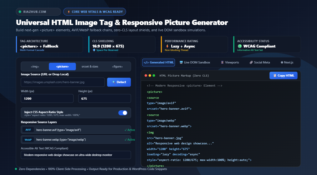
To achieve a perfect 100/100 Core Web Vitals score, modern frontend development demands an orchestration of multi-format fallback chains (AVIF and WebP), responsive resolution descriptors (srcset and sizes), native prioritization hints (fetchpriority and decoding), and mathematically strict layout space reservation (aspect-ratio). To eliminate the manual friction of hand-coding this complex markup, we built the free RiazHub HTML Image Tag & Responsive Picture Element Generator. In this architectural guide, we will unpack everything you need to master modern image delivery from first principles.
🛠️ Interactive Developer Tool
Want to generate production-ready <picture> and <img> tags with instant dimension auto-detection, AVIF/WebP cascades, and live DOM sandbox testing?
1. The Four Modern Image Architectures Explained
Modern HTML5 provides four distinct architectural paradigms for embedding graphical assets into a webpage. Selecting the right pattern depends strictly on whether your goal is simple single-source rendering, resolution switching, art direction, or semantic editorial captioning:
Architecture A: The Standard <img> Element (With Space Shielding)
The standard <img> tag is ideal for fixed-size UI elements, logos, avatars, and simple blog thumbnails that do not require multi-resolution switching. However, an un-shielded <img> without explicit width and height attributes is an anti-pattern. The browser does not know the asset’s aspect ratio prior to network download, meaning surrounding text abruptly jumps when the image pops into the DOM.
HTML
<img
    src="https://riazhub.com/assets/logo.png"
    alt="RiazHub Digital Utilities Company Logo"
    width="300"
    height="80"
    loading="lazy"
    decoding="async"
    style="aspect-ratio: 300 / 80; max-width: 100%; height: auto;">
Architecture B: The Responsive <picture> Element (Next-Gen Format Fallbacks)
The <picture> wrapper is a routing container that enables format negotiation and art direction. Browsers evaluate child <source> tags from top to bottom and render the very first source whose type or media condition is supported. If a browser does not support AVIF, it seamlessly falls through to WebP, and finally falls back to standard JPEG or PNG inside the nested <img>.
HTML
<picture>
    <!-- 1. Cutting-Edge: AVIF (Highest Compression Ratio, ~50% smaller than JPEG) -->
    <source type="image/avif" srcset="hero.avif">

    <!-- 2. Modern Standard: WebP (Supported across 97%+ of all browsers) -->
    <source type="image/webp" srcset="hero.webp">

    <!-- 3. Universal Fallback & Execution Anchor: Standard JPEG/PNG -->
    <img
        src="hero.jpg"
        alt="Modern workspace setup with laptop and design sketches"
        width="1200"
        height="675"
        loading="lazy"
        decoding="async"
        style="aspect-ratio: 1200 / 675; max-width: 100%; height: auto;">
</picture>
Architecture C: Resolution Switching with srcset & sizes
When an image maintains the exact same aspect ratio but should deliver smaller file sizes to mobile screens and dense resolutions to 4K retina screens, srcset coupled with sizes is the optimal solution. The w descriptors notify the browser of each candidate image’s actual pixel width, while sizes informs the browser how wide the image will display relative to the viewport.
Architecture D: Semantic <figure> and <figcaption>
For editorial content, photojournalism, technical diagrams, and scientific research publications, HTML5 semantics require wrapping imagery inside a <figure> element paired with a <figcaption>. This provides screen readers and search engines with unambiguous structural associations between the asset and its explanatory caption.
2. Defeating Cumulative Layout Shift (CLS) Forever
Cumulative Layout Shift (CLS) measures the visual stability of a webpage. A CLS score greater than 0.1 puts a website in Google’s “Poor” or “Needs Improvement” bracket. Un-dimensioned images are the leading cause of CLS worldwide.
⚠️ The Layout Reflow Trap
When a browser encounters <img src="photo.jpg" class="responsive"> where CSS specifies width: 100%; height: auto;, the browser reserves 0 pixels of vertical height initially because it does not yet know the image’s dimensions. As soon as the header bytes arrive over the network, the image suddenly expands, pushing all subsequent paragraphs down the screen.
To prevent this, modern CSS rendering engines compute an intrinsic aspect ratio when both width and height attributes are explicitly declared on the HTML element. Furthermore, adding the modern inline CSS property aspect-ratio: W / H guarantees layout space reservation even before external stylesheet stylesheets have completely downloaded.
With the RiazHub HTML Image Tag Generator, you can simply paste any image URL or drag-and-drop a local file. The tool automatically reads natural dimensions, calculates the exact aspect ratio (e.g. 16:9, 4:3, 1:1), and injects both the explicit dimensional attributes and the CSS aspect-ratio shield into your final code.
3. Next-Gen Formats: Why AVIF & WebP are Non-Negotiable
Bandwidth efficiency is the cornerstone of passing the Largest Contentful Paint (LCP) assessment. Transitioning from legacy JPEG or PNG files to modern encoding algorithms produces radical file size reductions:
📊 Empirical Compression Benchmarks
• AVIF (AV1 Image File Format): Delivers approximately 50% smaller file sizes than JPEG and 20% smaller than WebP at identical visual perceptual quality. It supports 10-bit and 12-bit color depths, High Dynamic Range (HDR), and lossless alpha transparency.
• WebP: Developed by Google, WebP files are on average 26% to 34% smaller than comparable JPEGs and support 24-bit transparency. WebP enjoys universal 97%+ global browser adoption.
Using a single-source format forces you to choose between cutting off older browsers or punishing modern users with bloated JPEG downloads. By utilizing the <picture> element generated via our online image tag studio, your server delivers bleeding-edge AVIF to modern Chrome, Safari, and Firefox browsers, while gracefully serving WebP and JPEG to legacy systems.
⚡ Instant Next-Gen Layer Builder
Don’t hand-write complex source layers. Use the 1-click “Auto Next-Gen” button in our generator to automatically assemble AVIF and WebP fallback layers in seconds.
4. Demystifying srcset and sizes Viewport Logic
Many developers struggle with the mathematical relationship between srcset and sizes. A common misconception is that the browser selects images based on device screen size alone. In reality, the browser chooses candidates based on a formula combining Viewport Width × Device Pixel Ratio (DPR).
Here is how you structure a production-grade srcset configuration:
HTML
<img
    src="photo-800.jpg"
    srcset="photo-400.jpg 400w, photo-800.jpg 800w, photo-1200.jpg 1200w, photo-1600.jpg 1600w"
    sizes="(max-width: 640px) 100vw, (max-width: 1024px) 50vw, 1200px"
    alt="Panoramic mountain landscape under morning mist"
    width="1200"
    height="675"
    loading="lazy"
    decoding="async">
In the example above:
(max-width: 640px) 100vwtells the browser: “If the screen is 640px wide or narrower, this image will stretch across 100% of the viewport width.”(max-width: 1024px) 50vwtells the browser: “On tablets and laptops up to 1024px, the image will occupy 50% of the screen width (such as in a 2-column layout).”1200pxis the fallback: “On larger desktop displays, this image never exceeds a max width of 1200px.”
Armed with this knowledge, a mobile device with a 375px viewport and a 3x Retina display calculates 375px × 3 = 1125px and intelligently downloads the photo-1200.jpg file instead of wasting cellular data on the huge 1600px asset!
5. Loading Optimization: When to Lazy-Load and When NOT To
Native browser lazy-loading via loading="lazy" is one of the most effective web performance features added to the HTML specification. However, blindly adding loading="lazy" to every image is a fatal mistake that severely damages your LCP score.
The Golden Rule of Image Priority:
- Above-the-Fold (Hero Banners & LCP Elements): NEVER lazy-load these images. Lazy-loading delays their discovery until the browser’s main thread runs layout computations. Instead, assign
loading="eager"and addfetchpriority="high". This signals the network preload scanner to immediately fetch the hero graphic ahead of scripts and stylesheets. - Below-the-Fold (Content Images, Grids, Footers): Always assign
loading="lazy"anddecoding="async". This defers network requests until the user scrolls within proximity of the viewport, freeing main-thread resources for interactive scripts.
You can test this instantly using the pre-configured presets inside the RiazHub HTML Image Tag Generator, toggling between the “⚡ Hero Banner LCP” preset and the “📰 Content Blog Lazy” preset with a single click.
6. WCAG 2.1 Accessibility: Alt Text Best Practices
Under WCAG 2.1 Level AA criteria, every image must provide an equivalent text alternative unless it is purely decorative. Writing high-quality alt text benefits both visually impaired users relying on screen readers and search engine web crawlers.
♿ Accessible Image Guidelines:
1. Informative Images: Convey the actual meaning, context, or data displayed in the image. Keep it under 125 characters (screen readers truncate long descriptions). Avoid redundant phrases like “image of” or “picture of”.
2. Decorative Images: Background textures, abstract shapes, and stylistic dividers should include an explicit empty alt attribute: alt="" and ideally aria-hidden="true". If you omit the alt attribute entirely, screen readers will read out the ugly raw image filename!
7. Social Meta Tags & React / Next.js Component Export
Modern digital publishing extends far beyond the browser viewport. When articles are shared across Twitter (X), LinkedIn, Facebook, and Slack, social crawler bots inspect the <head> section for Open Graph and Twitter Card tags.
When you configure an image in the HTML Image Tag Generator, you can click on the “Social Meta (OG & Twitter)” tab to view a real-time social card preview and export copy-pasteable meta tags:
HTML
<meta property="og:image" content="https://riazhub.com/assets/banner.jpg">
<meta property="og:image:width" content="1200">
<meta property="og:image:height" content="675">
<meta name="twitter:card" content="summary_large_image">
<meta name="twitter:image" content="https://riazhub.com/assets/banner.jpg">
Building a frontend with React or Next.js? The tool also provides a dedicated “React & Next.js” tab that automatically converts your configuration into a native <Image src="..." width={1200} height={675} priority /> component, alongside standard Markdown syntax ().
8. Comparison: Manual Coding vs Standard CMS vs RiazHub Studio
How does utilizing a dedicated image tag generator compare to manual coding or default WordPress image blocks?
| Capability / Feature | Manual HTML Coding | Standard CMS Defaults | RiazHub Image Tag Studio |
|---|---|---|---|
| CLS Space Shielding | Manual Math | Partial Attributes | Automated CSS aspect-ratio |
| AVIF & WebP Fallback Chains | Tedious Syntax | Requires Heavy Plugins | 1-Click Auto Next-Gen |
| Dimension Auto-Detection | Manual Inspection | Local Media Library Only | Instant via URL & Dropzone |
| LCP fetchpriority Controls | Often Forgotten | Not Exposed | Dedicated High/Low Toggle |
| Live Multi-Device DOM Preview | Requires Local Server | Basic Post Preview | Real-Time Fluid Sandbox |
| Social & Next.js Code Exporters | Hand Crafted | None | 1-Click Copy Exporter |
🚀 Ready to Optimize Your Web Assets?
Never write manual responsive picture tags from scratch again. Generate bulletproof, accessible, Core Web Vitals compliant image code in seconds with zero ads or subscriptions.
9. Frequently Asked Questions (FAQ)
<picture> when you need format switching (e.g. serving AVIF to modern browsers and JPEG to older ones) or art direction (showing a cropped close-up on mobile and a wide landscape on desktop). Use <img srcset> when the image is the exact same visual content and aspect ratio, but you want to serve different resolutions based on viewport width or retina display density.max-width: 100%; height: auto;. The HTML width and height attributes merely declare the asset’s intrinsic aspect ratio to the browser layout engine so it can calculate reserved space before the image finishes downloading, completely preventing layout shifts (CLS).decoding="async" attribute informs the browser engine that the image can be decoded off the main execution thread. This prevents large high-resolution images from causing brief frame drops or stuttering during user scrolling and touch interactions.Image() DOM object and reads the naturalWidth and naturalHeight properties directly inside your browser’s V8 JavaScript engine. No image data is ever uploaded, stored, or sent to an external server.Universal HTML Image Tag & Picture Element Generator
Build responsive, SEO-optimized, and Core Web Vitals compliant HTML image markup with srcset, AVIF/WebP next-gen fallbacks, CLS shielding, and live DOM preview in real time.
HTML Image Standards, Core Web Vitals & Accessibility Guide
Modern best practices for zero Cumulative Layout Shift, optimal LCP scores, and WCAG 2.1 compliance.
aspect-ratio from the native width and height attributes before downloading the image asset. When combined with responsive CSS like max-width: 100%; height: auto;, the browser reserves the exact proportional box in the layout. Without these attributes, the image box starts with 0 height and suddenly expands upon download, triggering an abrupt layout jump that degrades your Google Core Web Vitals score.
loading="eager" and fetchpriority="high". This signals the browser's preload scanner to prioritize fetching the image packet over non-critical scripts and styles. Never set loading="lazy" on your hero image, as lazy-loading defers download until the viewport engine calculates intersection, which heavily delays your LCP metric.
alt attribute (ideally under 125 characters) that conveys the function and meaning of the visual. Purely decorative elements (background patterns, icons duplicated by adjacent text) MUST include an empty alt="" attribute so assistive screen readers skip them cleanly instead of announcing raw file URLs.